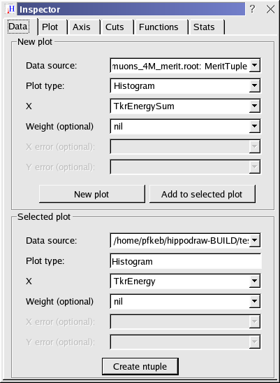
The data inspector tabbed panel
It consists of six tabbed panels that group together various types of controls. For the most part, the controls are obvious and need no explanation. There are some less obvious and will be explained in these pages.
All inspector controls are applied to the currently selected plot. One selects a plot by clicking on it with the mouse. Some plots will have multiple data representations while the controls can only be applied to one of them. In this case, one can control-click on the plot to select one of the data representations to enable the controls. The selected data representation will have its normal color, while deselected representations will be grayed out.
The data inspector tabbed panel
The name of the NTuple will be one of the following...
The plot type is chosen with the next combo box. See Plot types for an overview of the types available. Only dynamic versions of the various data representations are available. For s static versions can only be created from Python.
Once a plot type is chosen, one to four combo boxes appear to allow one chose the binding. The binding is the association of each axis with a column in the NTuple. Some plot types, such as the X-Y Plot and Scatter plot support optional bindings. They will be marked with (optional) in their name as shown above. If the binding is to nil, the the option is not taken.
The New plot button creates a new plot with the selected data representation and binding. and places it at the next available space on the canvas. The canvas will be scroll to make it visible if needed. The Add to selected plot button will add the selected data representation to the currently selected plot.
In most cases, data representations of different types can be added to one plot. However, a data representation that requires a Z axis display can not be added to a plot that doesn't have one. But the other way around works.
The lower box displays information on the selected plot. The data source and plot type is shown in the first two boxes. If mulitple data sources are available, one can change the data source used by the plot with the combo box. This only makes sense if the two data sources are compatible, i.e., have columns with the same label.
The remaining combo boxes allow one to change the binding of the plots. The mouse wheel is useful here if one want to look at, for example, a histogram of each of the data columns.
The binding controls are only available if only one data representation is selected. If multiple data representations are in one plot, then control-click on it with the mouse to select one of them. One can change the binding of the data representation with the combo box. If multiple plots are selected, one can use shift-click to select or deselect plots.
The Create ntuple button allows one to created an NTuple from the selected data representation. The NTuple can be saved to a file, accessed from Python, and used to create a new plot. The NTuple will contain either 4 or 6 columns depending on whether the plot is 2D or 3D. See hippodraw::DataPoint2DTuple or hippodraw::DataPoint3DTuple for the details.
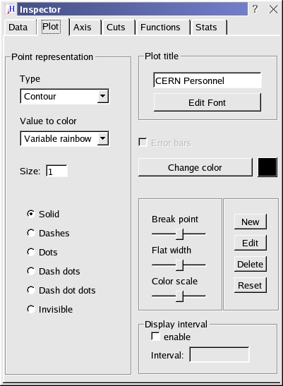
The plot inspector tabbed panel
The left hand box controls how the data points are represented. If not appropriate for selected data representation, some controls will be disabled. If the data representation are lines, then the selection of available line styles is displayed, as shown above. If the representation is formed from symbolss, the selection of available symbols is displayed.
Some data representations can display the data points in more than one way. When this is the case, the type of point representation can be changed with the Type combo box. For example, if one had created a ColorPlot and then chose Contour as the point representation then one has effectively converted it to a ContourPlot. The data representation is unchanged, just the point representation changes.
If color is involved, one can also chose the algorithm used to translate a data point value to a color with the Value to color combo box. Some of the algorithms have parameters that can be varied. If this is the case, then three slider and 4 buttons on the right hand side are enabled. It is a bit difficult to explain what each slider does. The best way to find out is to play with them.
Once can save the current parameter setting of one of the variable algorithms as a custom algorithm. The New button creates a new one which will be available for future sessions. The Edit button changes the parameter values of an exsiting one. One can remove one with the Delete button and reset an existing one to its default values with the Reset button.
On the right hand side there are controls for setting a new title, showing error bars, and changing the color.
The Display interval box needs some explaining. When an NTuple has changed, any plots bound to it are immediately updated. In the situation where the NTuple is changing very rapidly, updating the plots with each change of the NTuple can be costly. For example, with a data acquisition taking 100's of events per second, updating the plots with each event will probably slow down the event taking rate. When the display interval is enabled, then the plots are only updated for each n events as specified in the Interval box. If the NTuple is changing at 100 times a second, one can set the interval to 100 to see the plots update once a second with only 1% slow down in the data rate.
If multiple data representations are in the selected plot, one needs to control-click with the mouse to select one of them in order to enable the controls.
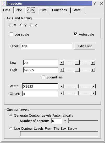
The axis inspector tabbed panel
If the data representation is one that involves binning, then the width and offset controls are also enabled. The width control sets the width of the bins. The offset control moves the edges of the bins by a fraction of their width. If multiple data representations are on one plot, one will need to control-click with the mouse to enable these controls. If the plot is not binned, then the controls are disabled. If the binned plot is static, then the controls not disabled, but are not editable.
There are five ways to these axis values.
The Auto scale check box shows the state of auto scaling. Plots are initially scaled to show all the data and binned to 50 bins. Using any of the controls above it will turn off auto scaling as they have now been manually scaled. Click on this check box to auto scale again. Auto scaling is disabled for statically binned plots.
The Contour Levels box becomes enabled when the data is represented with contour lines, at different levels of value. If the upper radio button is chosen, the default, the the contour levels are equally spaced and the user can change the number either with the text box or the slider. The default number of contours is 6, which seems to be sufficient for most plots. The slider allows one to go to 100 levels, which produces something that looks like a solid color. This is useful if there are large areas of nearly the same data value. If the lower radio button is selected, then the user can manually select the contour values. They should be in ascending order, however.
First a data cut, sometimes called a filter, limits input to a plot. Once a cut has been applied to a plot, then only those rows of the NTuple that pass the cut criteria will be accumulated into the plot. The cut criteria is the value of the variable in some column of that row, is within the cut range.
The second form of cut is a cut on th range of data used for fitting a function to the data. The cuts inspector window is shown below.
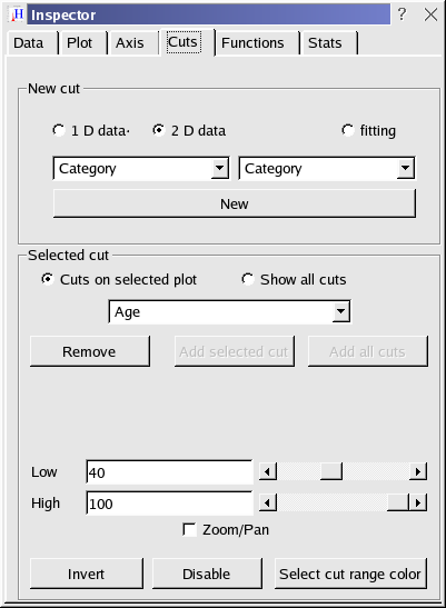
The cuts inspector tabbed panel
Clicking on the New button than adds that cut to the selected plot. A histogram of the cut variable is also added to the canvas. The shaded region marks the data range that is accepted.
The lower box allows one to vary the cut range and to add and remove cuts. The radio button at the top of this box selected whether to display in the combo box only the cuts on the selected plot (left button) or all the cuts for with the same NTuple as the selected plot. When showing only cuts on the selected plot, the Remove button can be used to remove the cut. When showing all the cuts, either the Add button can be use to add a cut to the selected plot, or the Add all cuts button can be used to add all existing cuts to the selected plot.
One can then selected a cut with the combo box and the controls change the parameters of that cut.
By default, the controls set the upper and low range of the cut. If the Zoom/Pan check box is clicked, then the controls set the width of the cut and its position. This allows one to zoom in on a selected range of the cut variable and pan across the cut variable. As with the slider controls in the Axis inspector, there are five ways to control the range.
The Invert button allows one the change the cut from being inclusive (the default) to exclusive and back again. Finally, there's a button that allows one to change the cut range shading. The Disable button can be used to disable the cut without removing it.
One can add multiple cuts to a selected plot. One can also have a single cut applied to multiple plots. One can also apply a cut to a plot displaying a cut. The later might be useful when multiple cuts are on a plot that are not orthogonal and one wishes to see the interaction of one cut on another.
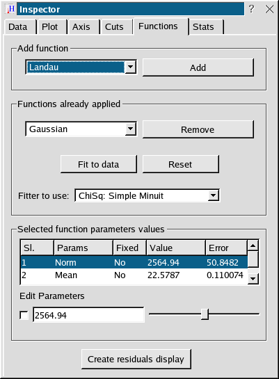
The function inspector tabbed panel
The upper box controls the adding of a function to the selected plot, or selected data representation if multiple data representations are in the selected plot. When a function is applied, a reasonable guess is made for the function parameters so that they overlay the selected data representation. Then a minimization of the chi-squared (fitting) is tried. If it succeeds, the function parameters remained at this fitted value, otherwise they are restored to the initial guess. To change the parameters to make a best fit to the selected data representation, click on the Fit to data button.
The middle box shows the functions applied to the selected data representations. The Remove button allows on to remove the function shown in the combo box. Multiple functions are allowed in which case the sum of the functions will be displayed and used for fitting. The sum of functions is displayed in blue, while he individual functions in red. A choice of fitting techniques is given in the Fitter to use combo box. Fitting can be done by minimizing chi square (ChiSq) or likelihood (MLEH). For chi square, either the Levenberg Marquart minimization algorithm or a version of the Minuit minimization algorithm can be used. Note that the C++ version of Minuit is used, not the Fortran version or one derived from the Fortran version. For likelihood, either the BFGSFitter or Minuit can be used. Minuit fitting is only available if HippoDraw was built with Minuit, otherwise it doesn't appear as a choice. With the BFGSFitter, the Pearson statics is also available.
The Reset button restores the function parameters to those before a fit was done.
The lower box allows one to vary the value of the selected function's parameters. If more than one function has been applied, all the parameters are listed. The controls below box listing the parameters will be applied to the selected parameter. The check box to the left of control allows one to fix a parameter thus removing it from a fit.
Finally, the bottom button allows one to create an XYPlot on the canvas displaying the residuals of the function and the data representation.
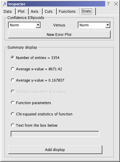
The stats inspector tabbed panel
To create a textual representation, selected one then click on the Add display button. Not all summaries can be applied to all data representations. The basic distinction is between data representations that are functions and those that are not. The inappropriate summaries will be grayed out.
All textual representations are live. That is, if there is a change in the data representation that they are attached to, then the text displayed will change as well. For example, if the Chi-squared is applied to a function, then any variations on the data, such as changing the bin width, or change in a function parameter will recalculate the chi-squared and update the summary display.
 1.4.3
1.4.3